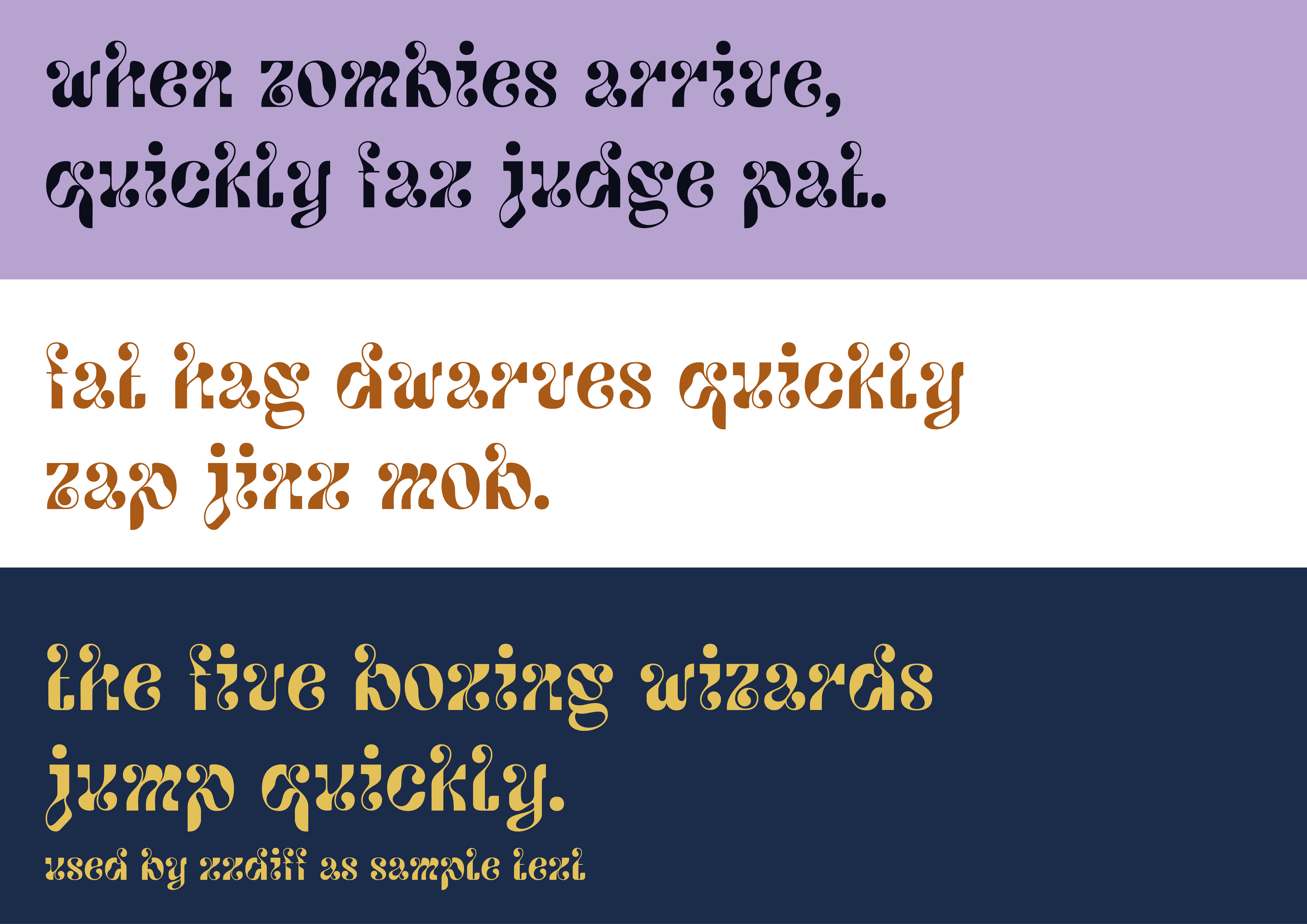
Aqua Fonto
With Aqua Fonto, I wanted to see how letterforms could flow and interact in a playful way. It’s a lowercase-only typeface with bold contrasts and quirky ligatures that make it fun to look at. One of my favorite parts of designing it was the drop-shaped elements in some of the letters—I loved them so much that I decided to add them everywhere, even in places where it’s pretty unusual. It gave the typeface a really distinct rhythm, almost like the letters are dripping or melting into each other. I enjoyed shaping each character and pushing legibility while keeping a strong sense of movement. It was one of my first typefaces, so it was more about experimenting than perfecting, but that’s what makes it special to me.


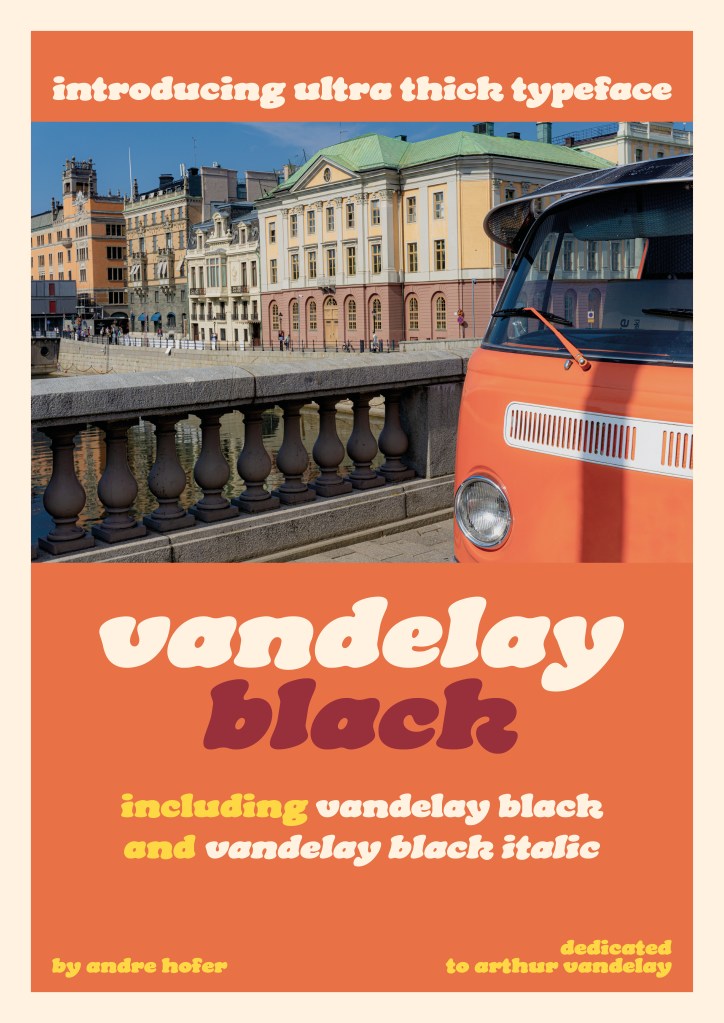
Vandelay Black
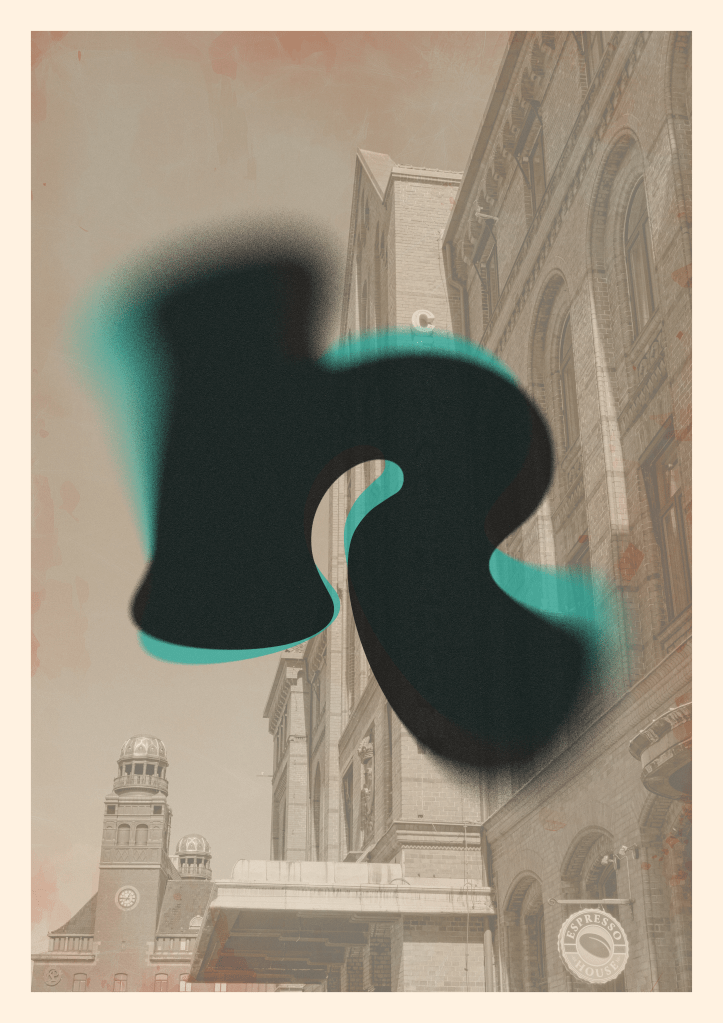
On the other hand, Vandelay Black takes a completely different approach. I designed this ultra-thick typeface to be bold, playful, and full of character. Its chunky, rounded forms give it a strong presence, perfect for attention-grabbing posters, packaging, or nostalgic yet modern branding. I also developed Vandelay Black Italic to add more versatility and motion to the typeface, creating a dynamic contrast between the two styles. The promotional designs for Vandelay Black, featuring a classic Volkswagen van I saw in Stockholm and a photo of Malmö Centralstation, reflects the font’s retro charm and sense of warmth.